Selected cases
Redesigning the Ion Performance Dashboard
Slashing Analyst Reporting Time by 86% and Empowering User Autonomy
YEAR
2021
COMPANY
Rock Content
KEYWORDS
Reports, Dashboard, Inbound Marketing, Customer service, SLA
Summary
In a hurry?
I know you would love to grab a cup of coffee before the next meeting, so here's a snapshot for you 💚
Research
Research included heuristic evaluations, interviews with CS Analysts, customers, and stakeholders, plus technical discovery. Key findings highlighted manual reporting as a bottleneck, customers struggling with reports, and unclear data. Design focused on balancing info density, desktop optimization, in-context education, and progressive enhancement.
Process
The process used a user-centered design methodology: research, ideation, prototyping, validation, and handoff. Key prototype features included a 'Highlights Panel' for quick insights, 'Pro Tips' for contextual recommendations, and new data panels. Validation via non-moderated usability testing showed strong usability but some 'Pro Tips' difficulty.
Results
The redesign significantly reduced analyst report production time by 86% (from 7 to just 1 business day). The new dashboard achieved an 84/100 average CSAT score over its first six months post-launch, indicating positive customer reception. Implementation was incremental, with both dashboards maintained for a smooth transition.
And now, the long version:
Project context
Welcome to Ion, by Rock Content
Ion is a low-code website builder focused on Conversion Rate Optimization (CRO) interfaces, enabling customers to build campaigns, generate leads, and track engagement. This project focused on redesigning the performance reporting dashboard to address significant inefficiencies for internal analysts and usability challenges for customers. The redesigned dashboard reduced the time required for analysts to generate reports from 7 business days to just 1 business day, marking an 86% improvement.
Challenges
The pickle
Business Problem: Internal Customer Success (CS) analysts dedicated excessive time (approximately 7 days per report) manually compiling, interpreting, and presenting performance data to clients. This process was inefficient and costly.
User Problem: Ion's customers struggled to independently understand the complex performance reports. This lack of clarity hindered their ability to optimize campaigns effectively and often required significant hand-holding from CS analysts, diminishing the perceived value and ROI of the platform.
Legacy dashboard
Our customers are committing the same mistakes on every new campaign... They have no clue of what they are doing wrong so we have to walk them through their own reports.
Customer success manager
My role & responsibilities
What my big brain and tiny hands did
As the Product Designer, I led the user research, ideation, user flow definition, wireframing, high-fidelity prototyping, usability testing, and collaborated on the final UI/UX specifications for handoff.
Process & solution
How & Why
Project Goals
Drastically reduce the time and effort required by CS analysts to generate and present reports.
Improve the clarity and usability of performance reports for end-users (customers).
Empower customers to autonomously understand their campaign performance and identify areas for improvement.
Introduce new, relevant data points requested by users.
Resolve existing bugs and usability issues within the reporting interface.
We employed a standard user-centered design methodology:
Research: Understanding the problem space, user needs, and technical constraints.
Ideation: Defining the user flow, information architecture, and core feature set.
Prototyping: Creating interactive mockups for visualization and testing.
Validation: Testing the proposed solution with target users and iterating based on feedback.
Handoff & Launch: Documenting specifications and collaborating with engineering for phased implementation.
Research & Discovery
Methods Used:
Heuristic Evaluation of the existing dashboard.
Interviews with CS Analysts (internal power users).
Interviews with Customers (end-users).
Stakeholder Interviews (to align on business objectives).
Technical Discovery (assessment of legacy code impact with developers).
Key Insights:
The manual reporting process was confirmed as a major operational bottleneck.
Many customers were unaware they could access reports directly or found them indecipherable when they did.
Data presentation lacked clarity, preventing users from drawing actionable conclusions.
Enhancing user autonomy aligned with Ion's SaaS strategy.
Significant legacy code required refactoring, increasing project scope but justified by potential long-term CS cost savings.
Ideation & Design Decisions
Activities:
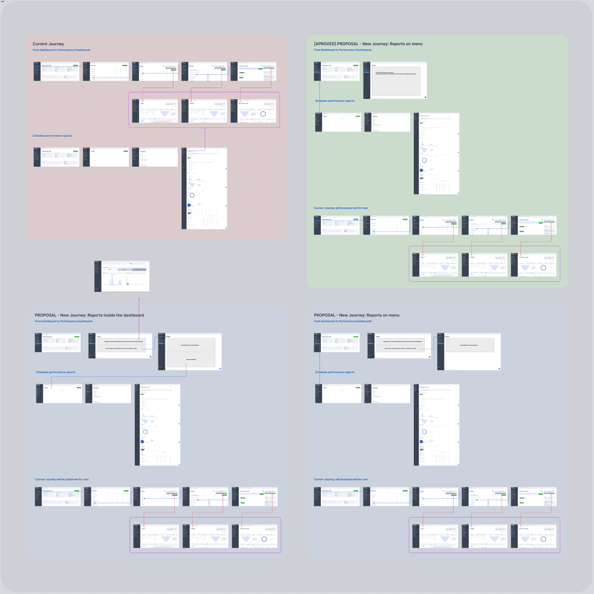
User flow mapping to optimize navigation.
Content mapping to define essential metrics (keep, remove, fix, add).
Competitive benchmarking (analyzing other dashboard solutions).
Sketching and low-fidelity wireframing.
Key Design Directions:
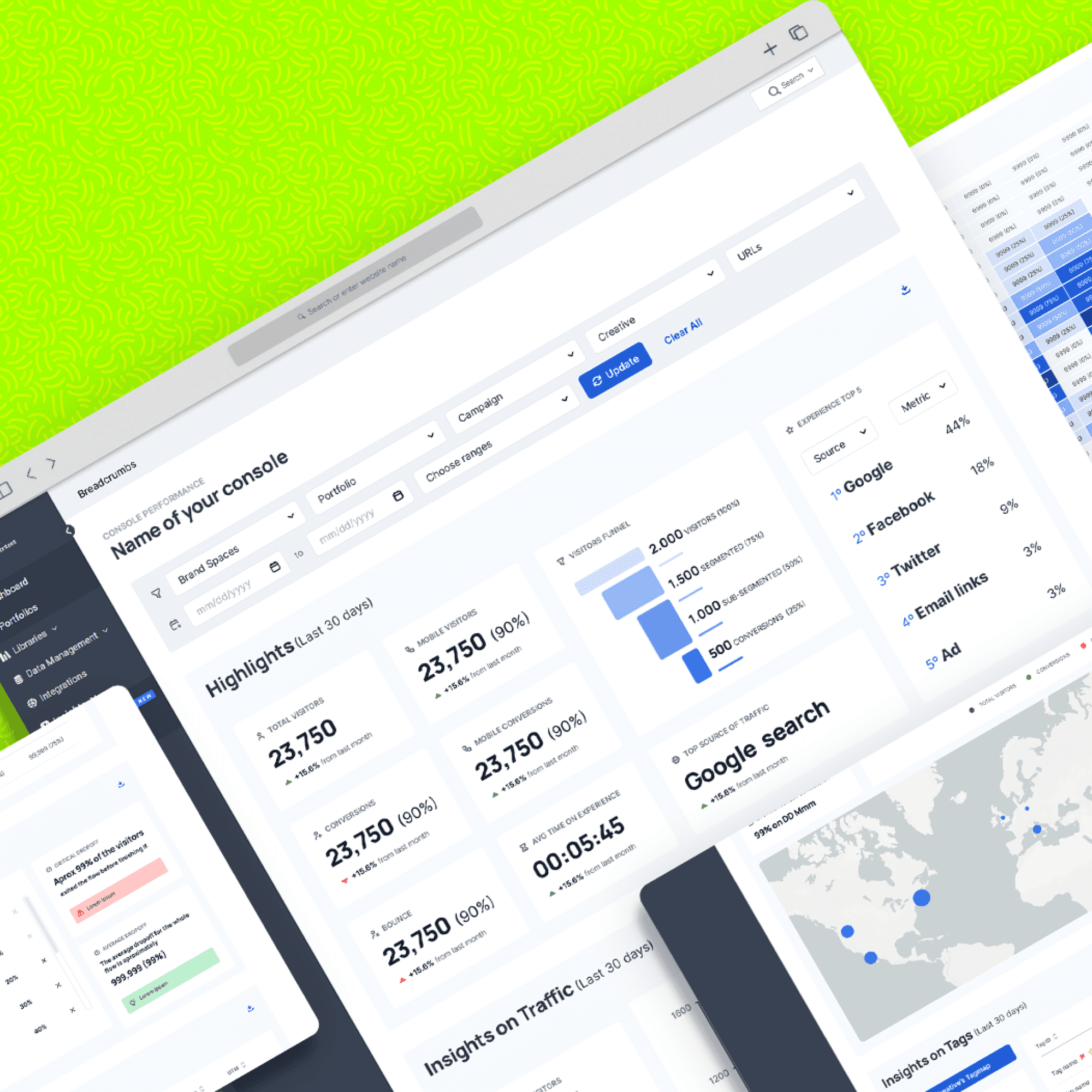
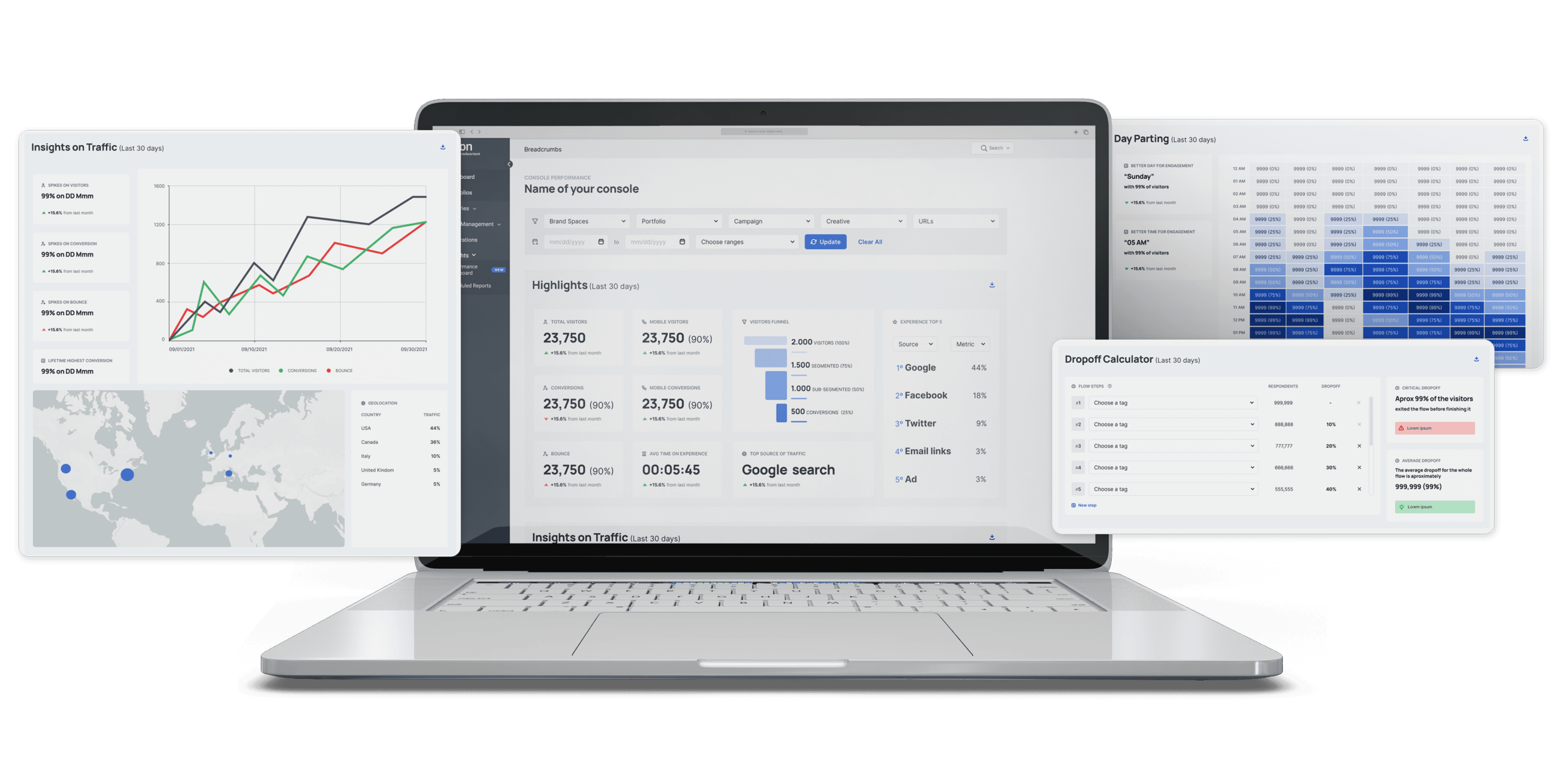
Balanced Information Density: Provide both high-level summary panels (for quick insights) and detailed data views (for deeper analysis).
Prioritize Desktop: Based on analytics showing a vast majority of desktop usage, the initial focus was on optimizing the desktop experience. Mobile responsiveness was planned for a later phase.
In-Context Education: Embed help links or tooltips (linking to wiki articles) within each panel to explain metrics and terminology.
Progressive Enhancement: Maintain old navigation paths initially while introducing new, more intuitive access points to ease the transition for existing users.
Prototyping & Key Features
Key Features Implemented:
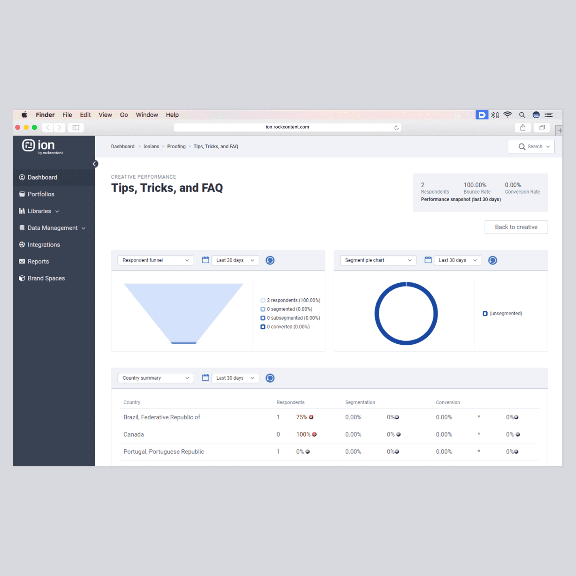
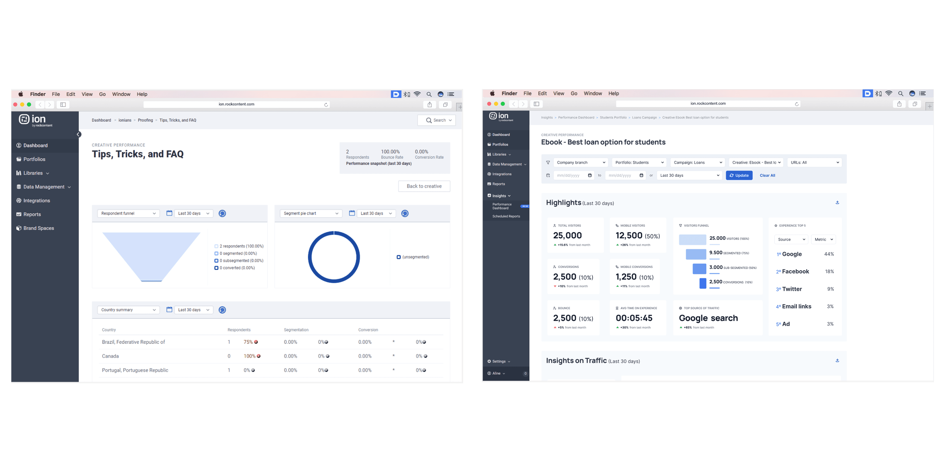
Highlights Panel: A top-level summary providing immediate visibility into key performance indicators.
"Pro Tips" Panel: Contextual, data-driven recommendations to guide user actions and strategy.
New Data Panels: Introduced four new sections featuring metrics identified as critical during research (e.g., specific conversion funnels, engagement breakdowns).
Design Challenges:
Working within the constraints of legacy code required careful UI decisions and limited the initial application of the full Design System. Modernizing the UI was a significant technical collaboration.
Validation
Method: Non-moderated usability testing sessions with 5 users representative of the customer base ('light users').
Tool: Maze.co
Task Performance:
Task 1: Apply filters to view a specific report (UX Score: 82.5/100)
Task 2: Locate a specific data point (UX Score: 80.4/100)
Task 3: Find a relevant "Pro Tip" recommendation (UX Score: 50.0/100)
Task 4: Calculate a performance drop-off using the data (UX Score: 86.0/100)
Learnings & Actions:
Task 3 revealed difficulty for novice users in locating or interpreting the new recommendations.
While overall usability was strong, we decided to launch with the current design but implement specific tracking on the "Pro Tips" feature to monitor usage patterns and inform future iterations.
User flows
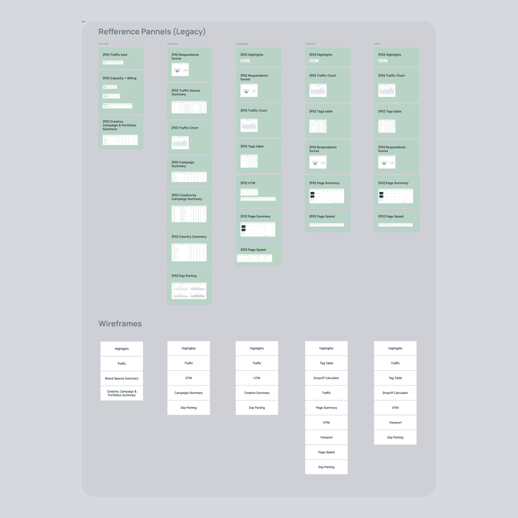
Panels maping and order of new panels for each level
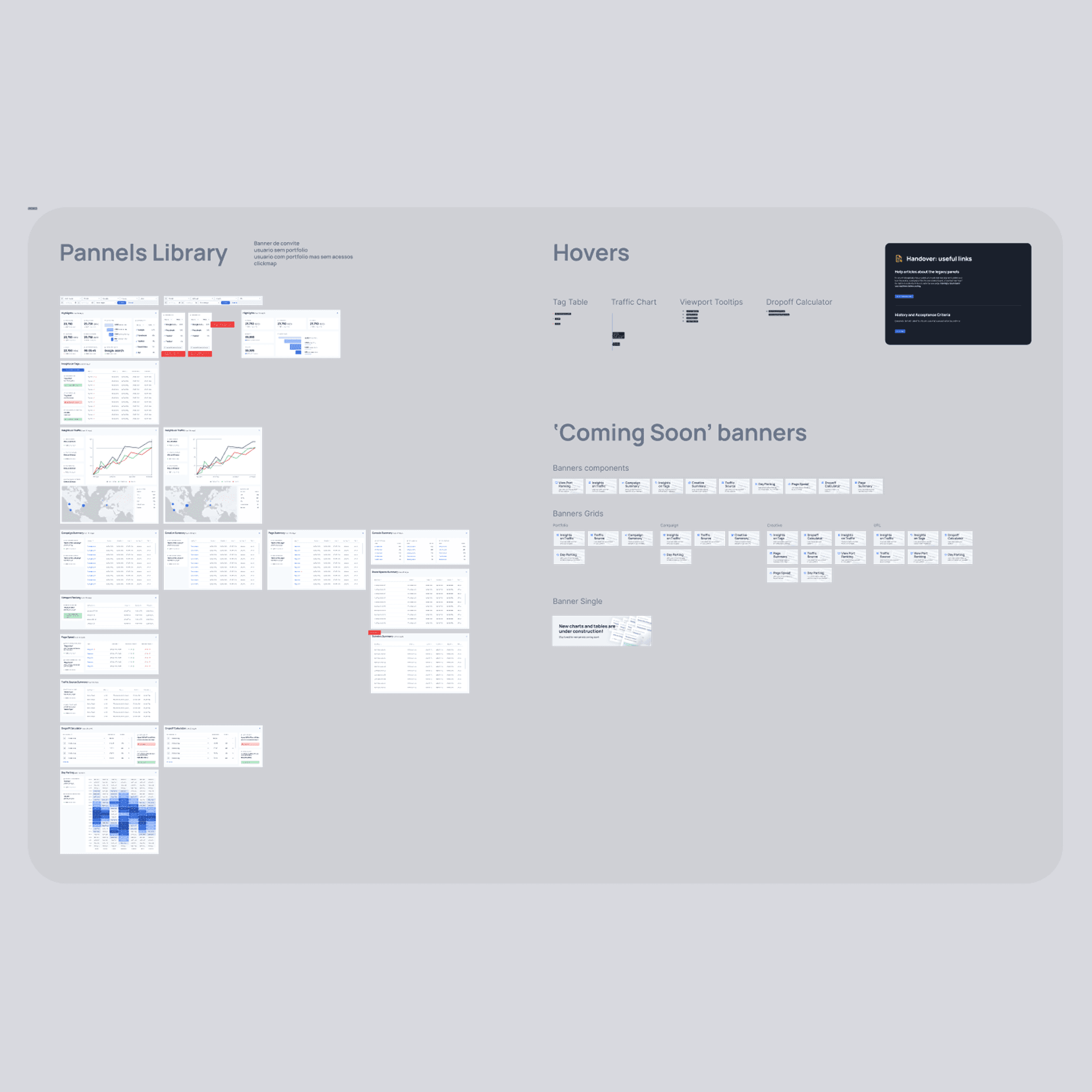
Library of components
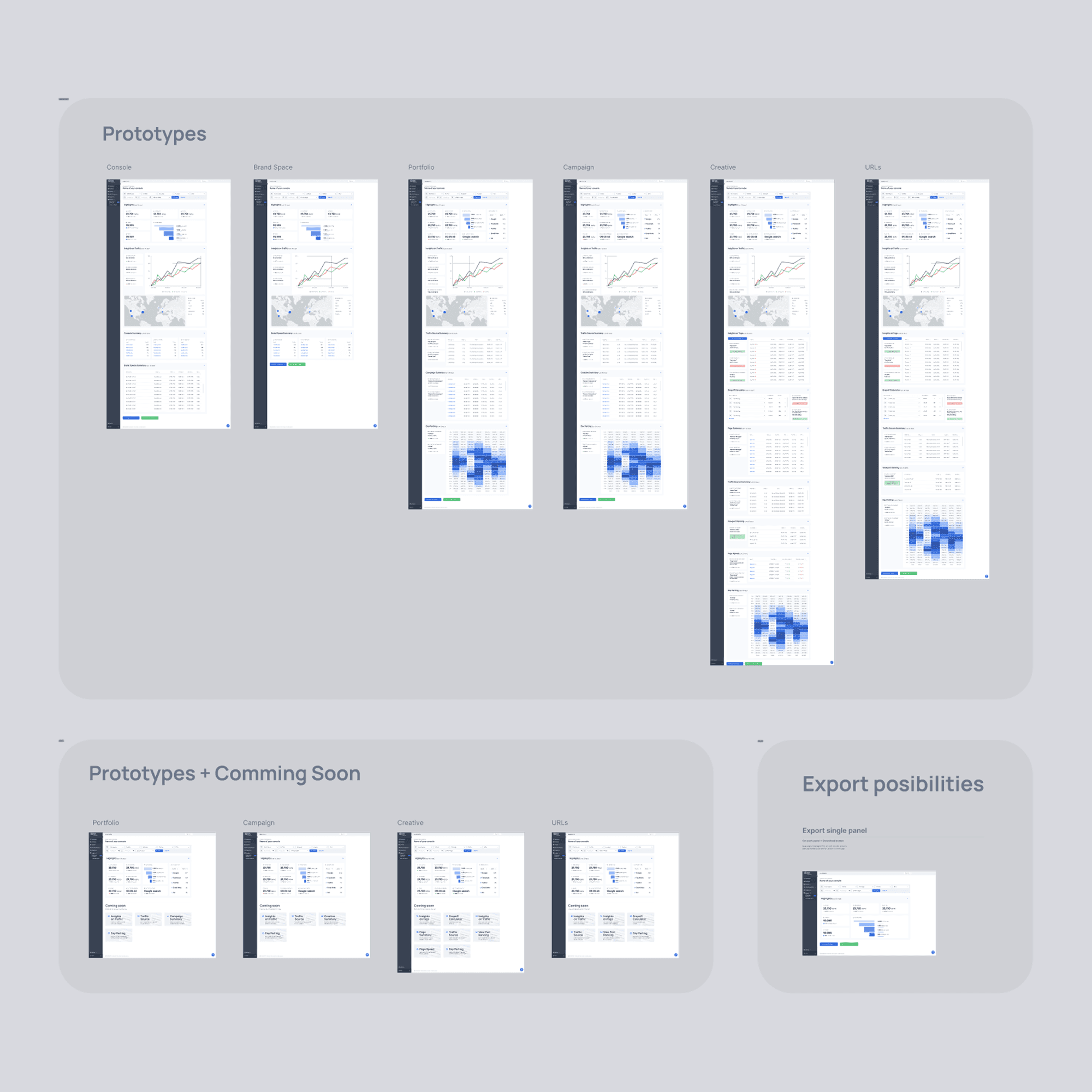
Screens
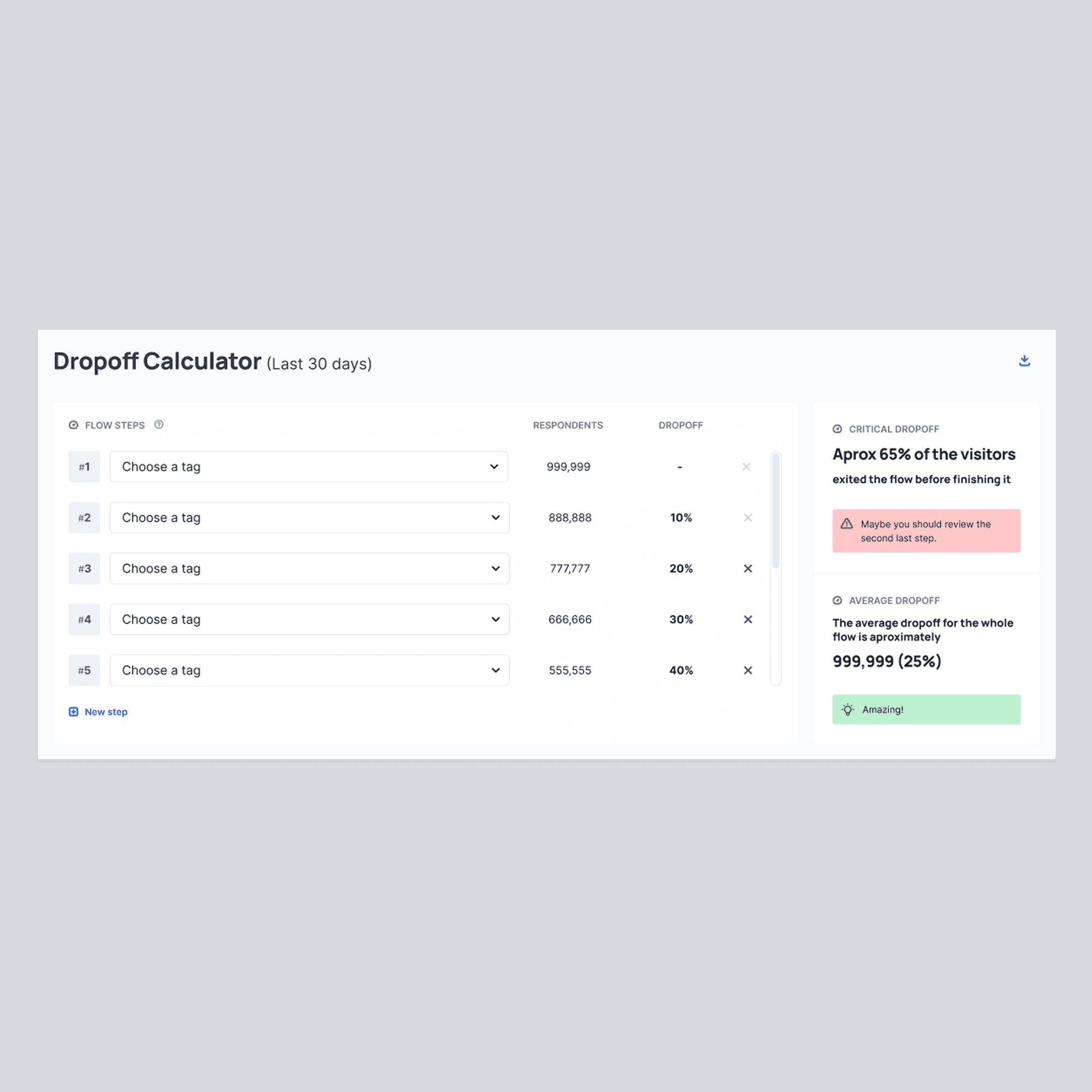
Dropoff calculator: new panel
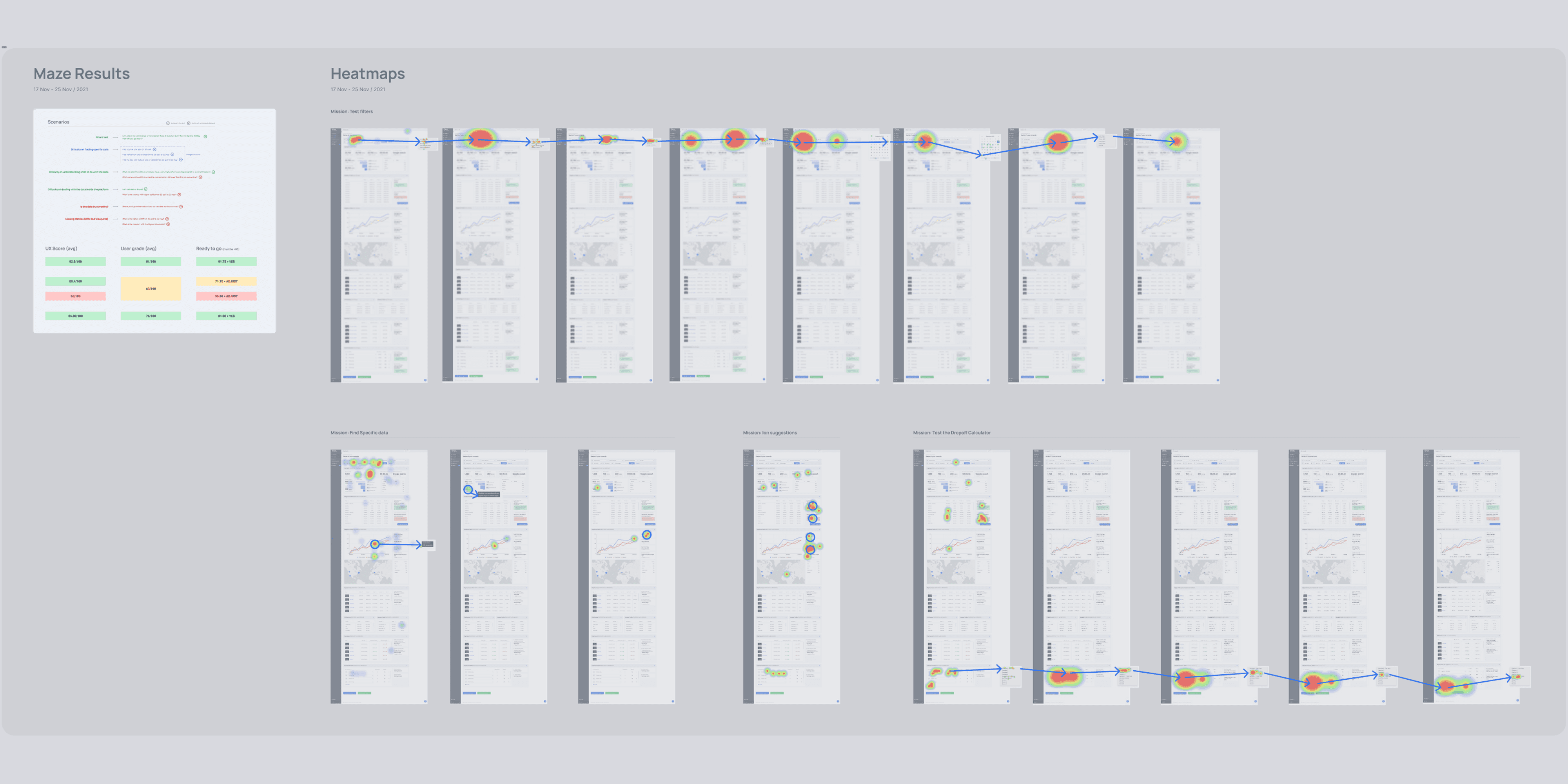
Usability test made with Maze: report and heatmaps
Results
The impact we caused
Implementation Strategy:
Addressed technical complexity by implementing the new dashboard panels incrementally.
Used "Coming Soon" banners on planned panels to gauge user interest and prioritize development backlog.
Maintained the old dashboard temporarily alongside the new one during the phased rollout to ensure a smooth transition.
Outcomes:
Operational Efficiency: Analyst time required to produce customer reports decreased from 7 days to 1 day (an 86% reduction).
Customer Satisfaction: Achieved an average CSAT score of 84/100 over the first six months post-launch, indicating positive reception of the new dashboard.
Learnings & next steps
For future iterations
Key Takeaways
Addressing technical debt (legacy code) proactively, even if it increases initial scope, can unlock significant long-term value and enable better user experiences.
Phased rollouts, potentially guided by user engagement metrics, are effective strategies for managing risk in complex redesign projects.
Providing not just data, but context and actionable recommendations within an interface significantly enhances user autonomy and product value.
