Selected cases
Revitalizing Checkout
How we went from 3 to 15% conversion in 2 months
YEAR
2023
COMPANY
Reclame AQUI
KEYWORDS
SaaS; B2B; User Experience; User Interface; Rapid Iterations; Data-driven decisions.
Summary
In a hurry?
I know you would love to grab a cup of coffee before the next meeting, so here's a snapshot for you 💚
Research
Findings from another research called our attention to the customers struggling while using the checkout. Marketing roadmap was on fire, so we drew a very lean MVP to enable sales to start on time with a fresh checkout.
Process
Redesigned the entire checkout, focusing on reducing the length of the flow and removing onboarding steps that were mixed in the flow. Deployed without user tests due to tight schedule, unfortunatelly.
Iterations
#1: Hotjar observation brought a few urgent fixes, and a few opportunities of improvements.
#2: Next, we expanded the checkout to offer annual payments, as planned.
Results
• 200% boost in sales in the first 30 days
• Average +376% boost in conversion in the following months
• 72% less steps on user flow
And now, the long version:
Project context
A new checkout for a new product
This project focused on completely redesigning the checkout process for the "RA Verificada" product. The goal was to address a critically low conversion rate (3.15%) and align the purchase experience with the product's new strategy, following a pivot based on research findings. As a UX Designer, I led the flow redesign, collaborated with cross-functional teams, and mentored a junior designer throughout the process. The result was a sustained increase in conversion to approximately 15%.
Challenges
Spring clean time!
Hey, what's that?
UX research (involving interviews, usability testing, and heuristic analysis), initially started for another product, revealed that "RA Verificada" urgently needed improvements to become the company's flagship product.
Core Problem
The existing checkout was a major bottleneck:
Extremely Low Conversion Rate: Only 3.15% of users completed the purchase.
High Abandonment: 64% dropped off at the very first form.
Long and Confusing Process: It mixed purchasing with onboarding, spanning 11 steps without clear progress indication.
Unnecessary Friction: Steps like password recovery were significant points of user drop-off.
Business Goal
Launch an efficient MVP of the pivoted product, starting with the basic plan, and ensure the new checkout supported growth targets and the new value proposition.
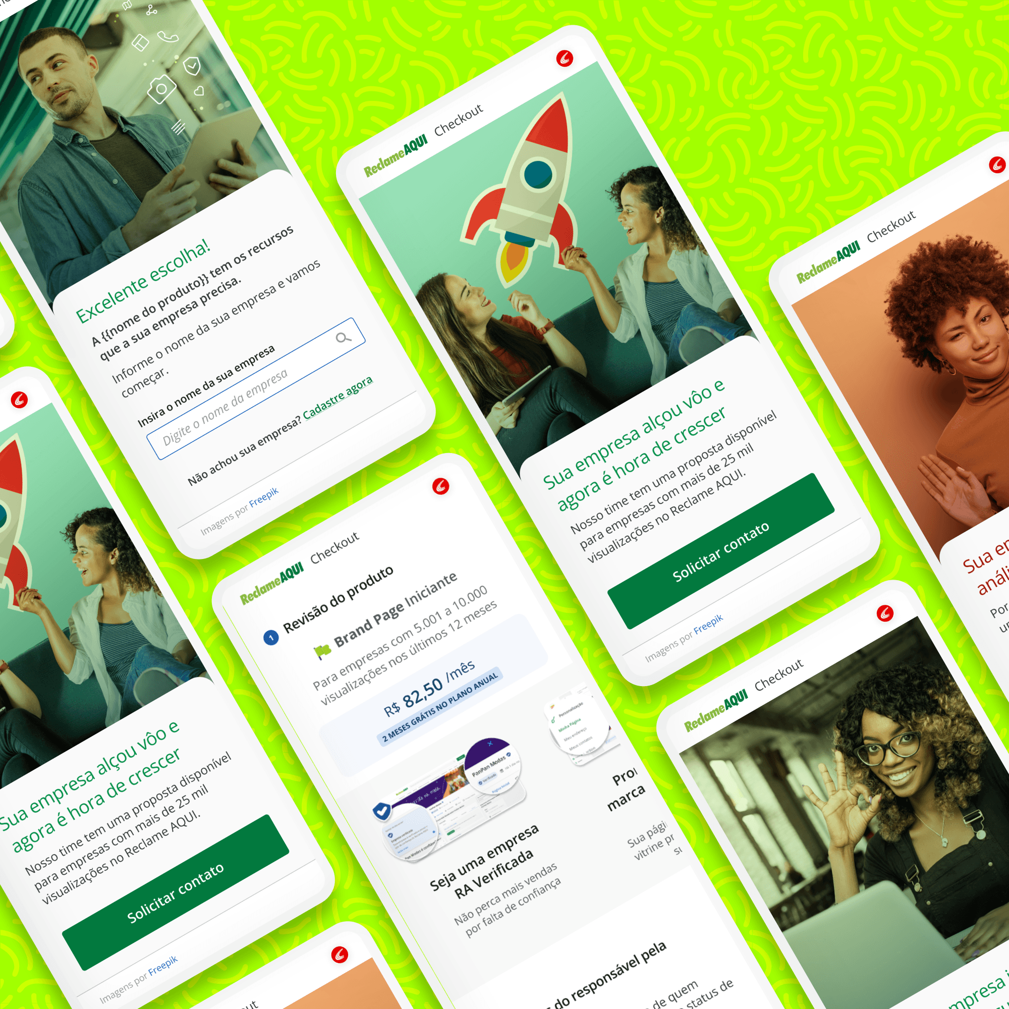
Original Checkout - User flow (translated for your convenience)
Original Checkout - High fidelity propotypes
Every time I thought it was over, another step came in. I saw 3 success messages during the purchase... it's totally confusing.
Interviewed customer
My role & responsibilities
What my tiny hands and big brain did
Key Activities
Planning the design process.
Analyzing current checkout performance and conducting benchmarking (using Baymard Institute data).
Designing the new user flow and information architecture.
Creating low-fidelity and high-fidelity prototypes.
Collaborating and aligning with Product, Engineering, CS, Marketing, and Growth teams.
Conducting design critique workshops.
Creating documentation for developer handoff.
Performing post-launch analysis (Hotjar, metrics) and planning iterations.
Mentoring a junior designer, guiding them through the design process.
Process & solution
The whys and hows
Analysis & strategy
We analyzed metrics and user behavior in the old checkout to identify the biggest friction points.
We benchmarked against high-converting e-commerce sites to identify best practices.
We mapped out the ideal flow, focusing on simplicity and clarity.
Design & collaboration
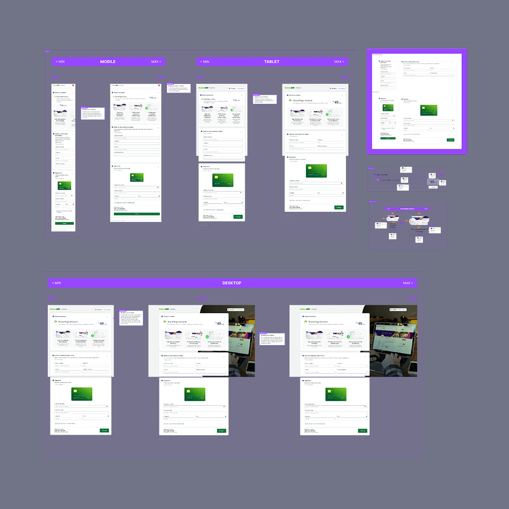
Simplified Flow: Reduced the process from 11 steps to 3 (or 2 for logged-in users), cutting perceived effort by 72-81%.
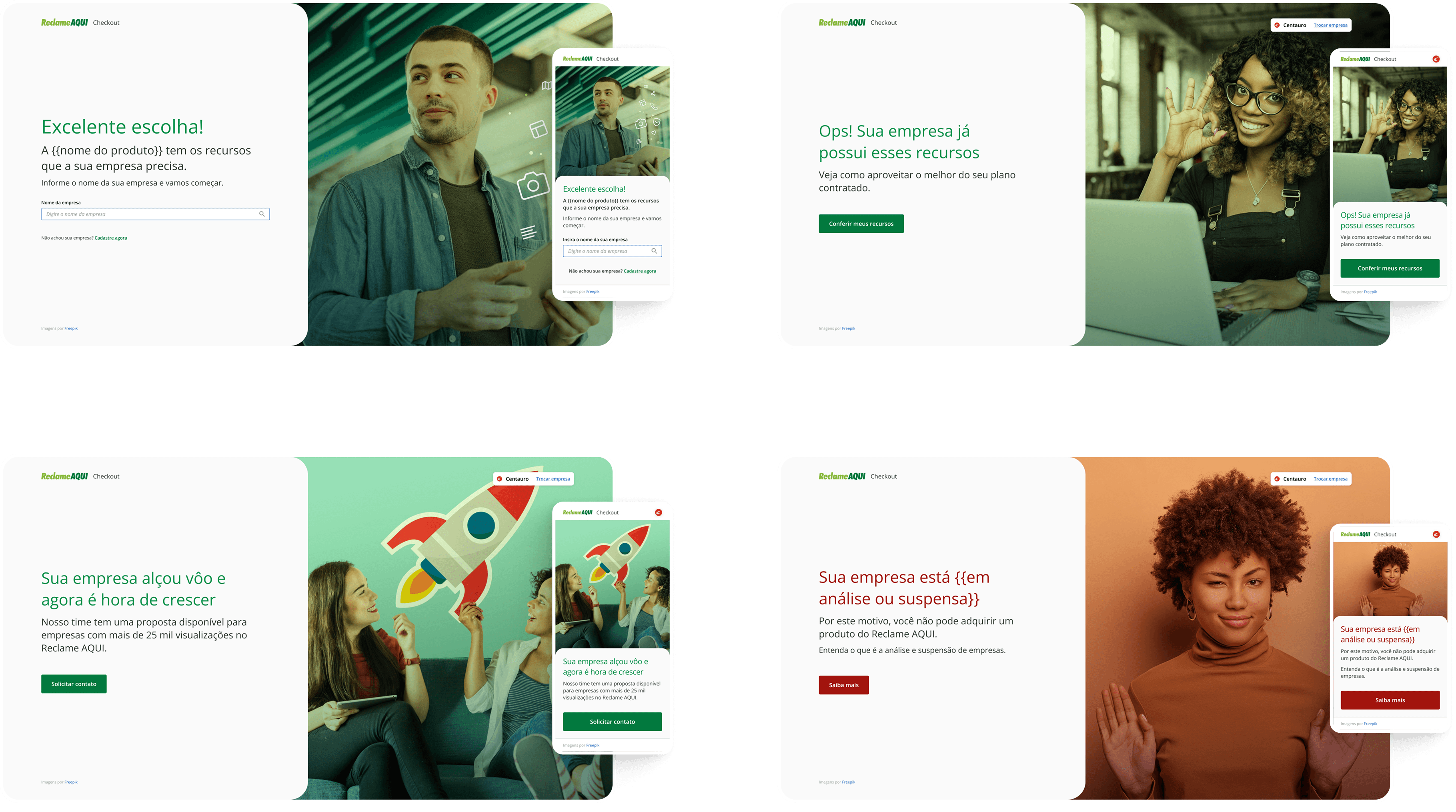
Friction Removal: Allowed users to identify their company without immediate login, bypassing the password recovery issue.
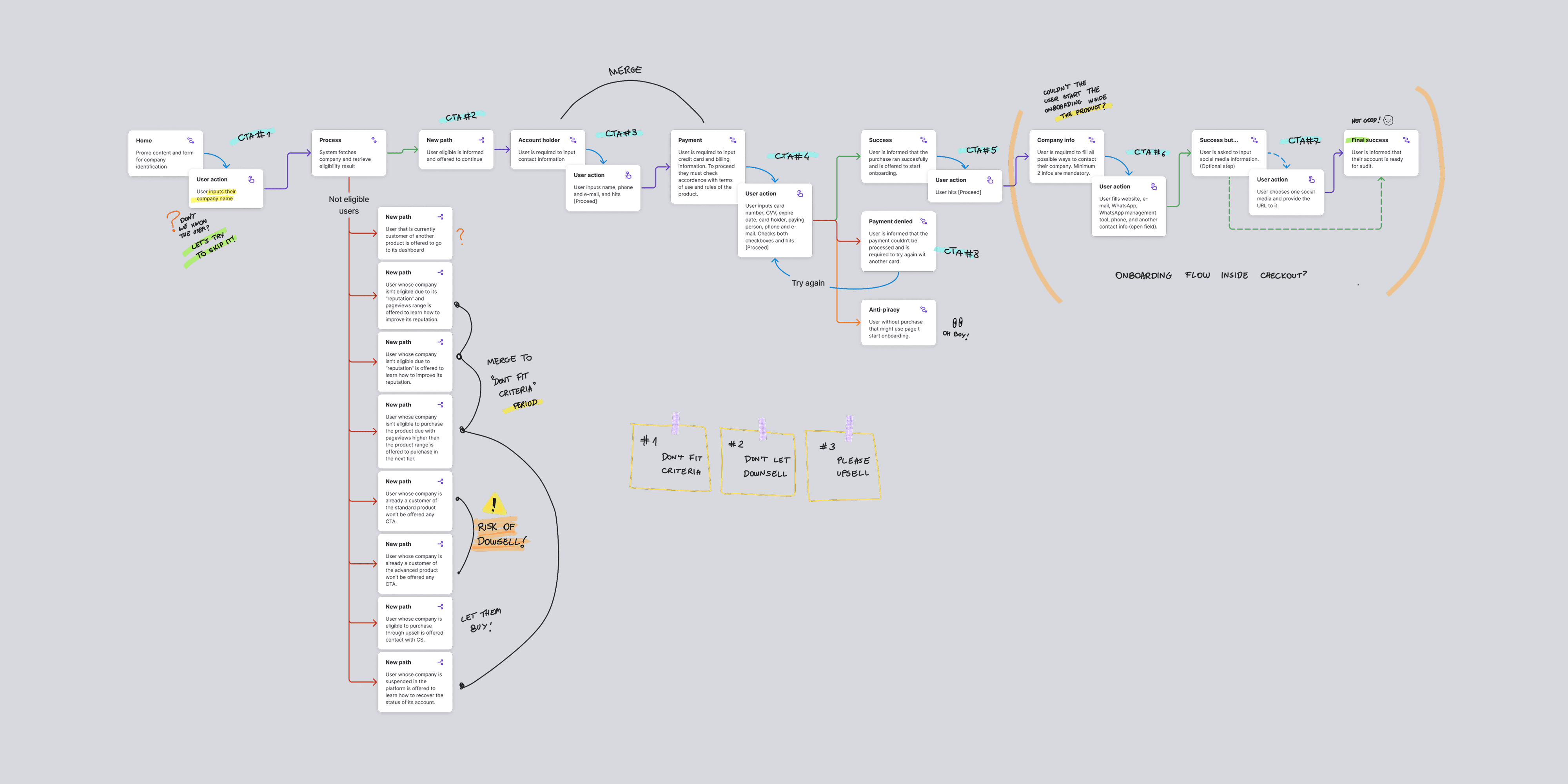
Clarity & Context: Separated onboarding from checkout and defined clear paths for different user scenarios (eligibility, product conflicts, account status).
Cross-Functional Alignment: Worked closely with the Growth team to ensure a smooth transition from landing pages to checkout. Held feedback sessions with stakeholders and tech teams.
Iterative Prototyping: Created low-fidelity prototypes to align on the flow and high-fidelity prototypes to detail the UI and interactions, always considering accessibility.
Constraint Management: Due to a tight deadline, we opted out of pre-launch usability testing, mitigating the risk with a robust post-launch metrics monitoring plan.
Implementation & handoff
Delivered detailed documentation and interactive prototypes to the development team.
Collaborated closely with developers and QA during implementation, adjusting details as needed.
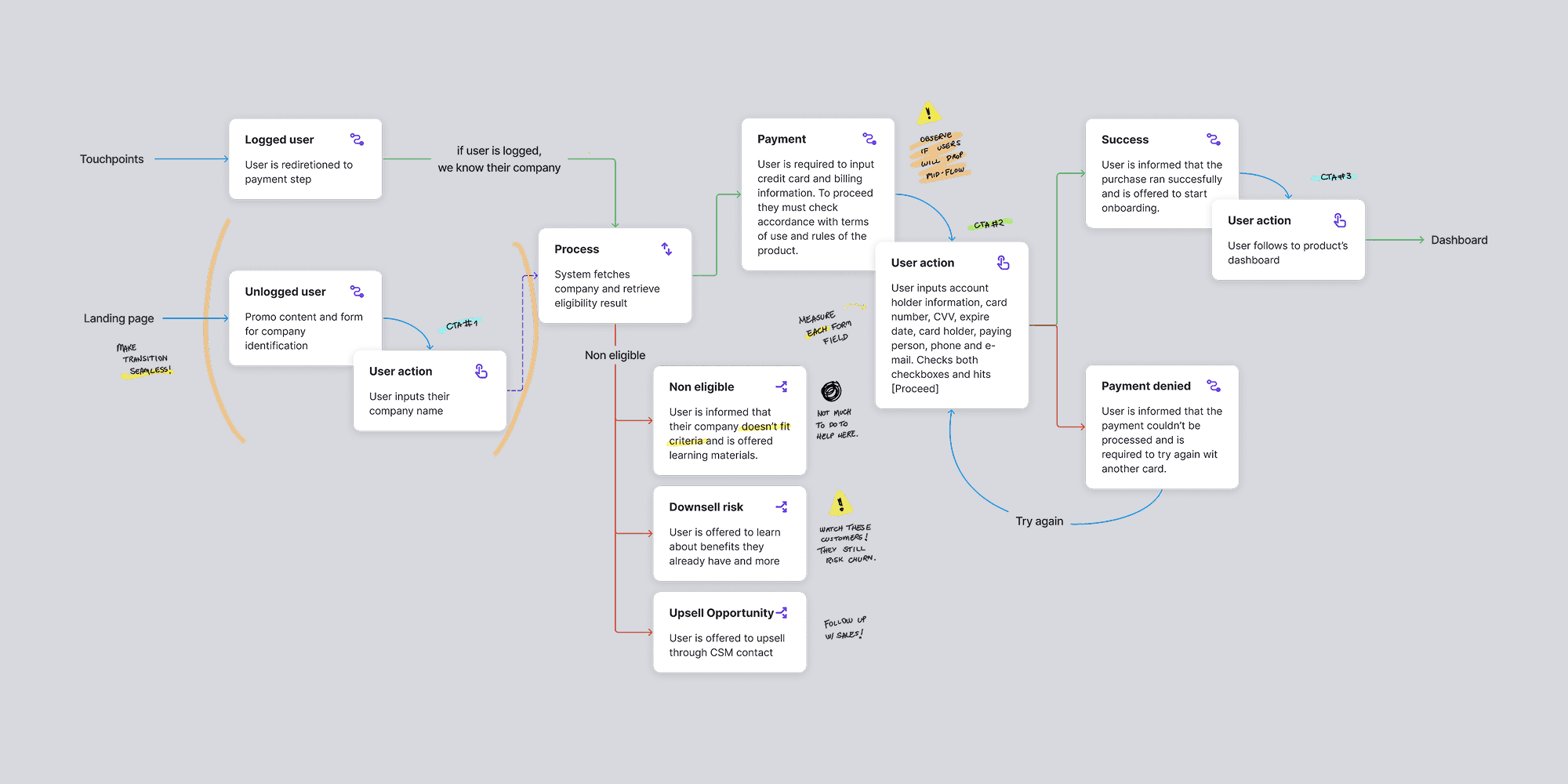
New checkout - user flow (translated for your convenience)
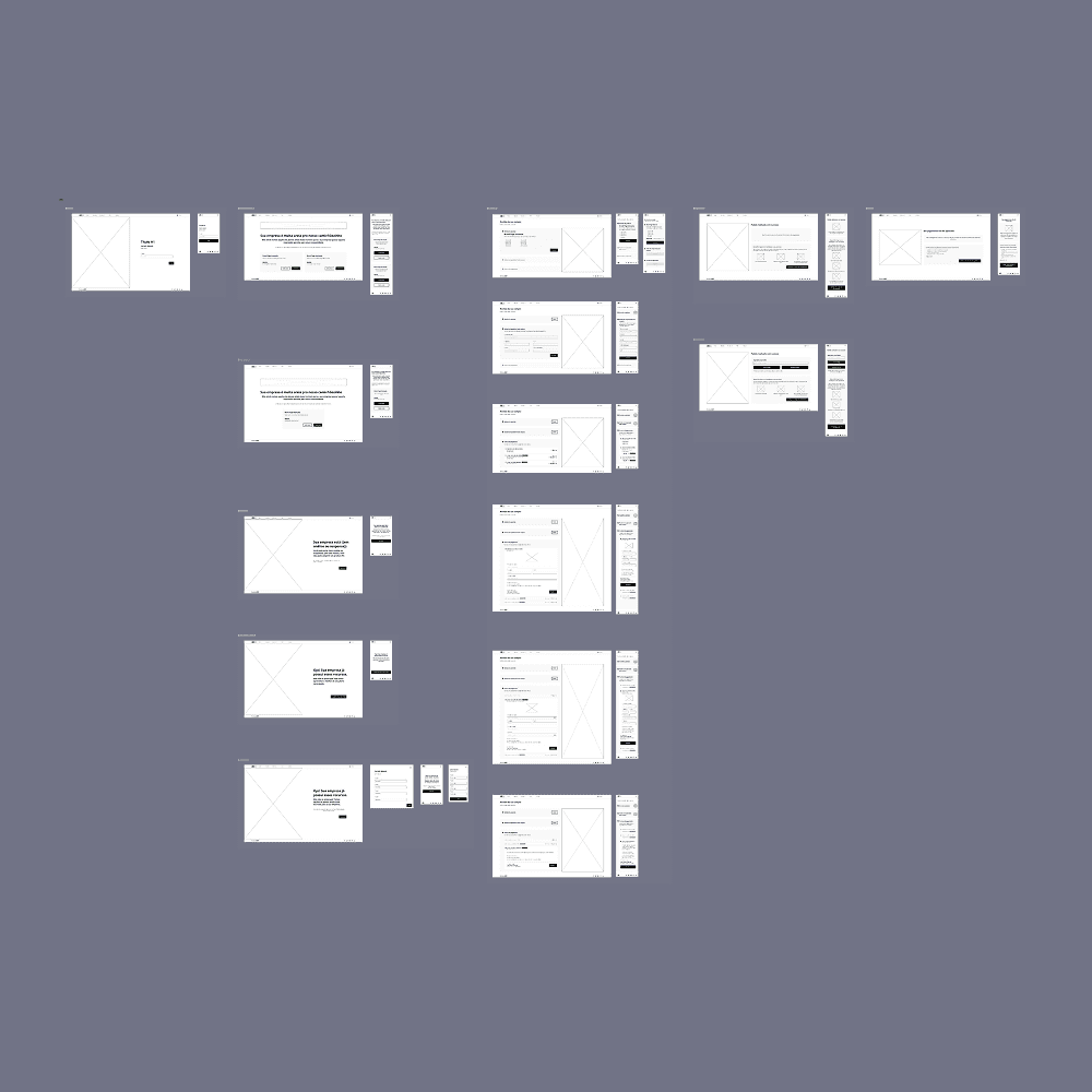
New checkout - Wireframes
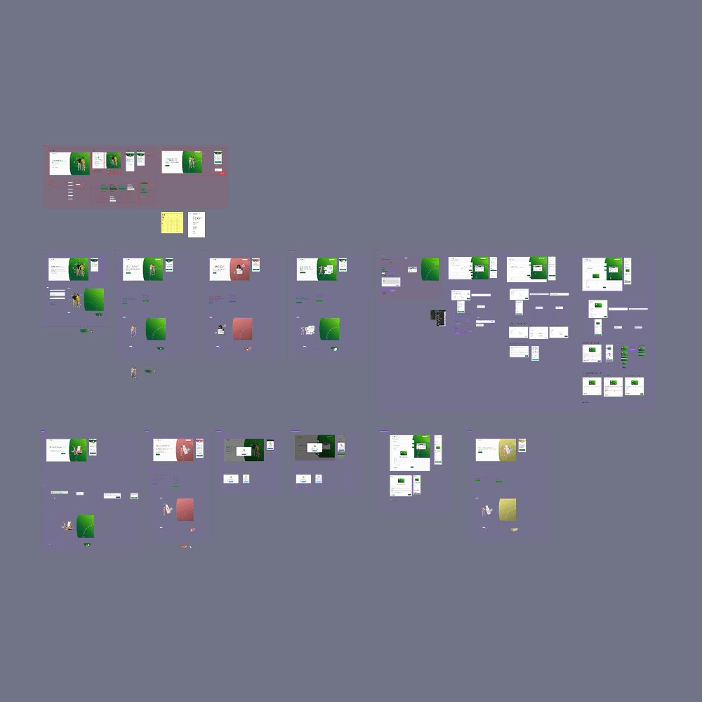
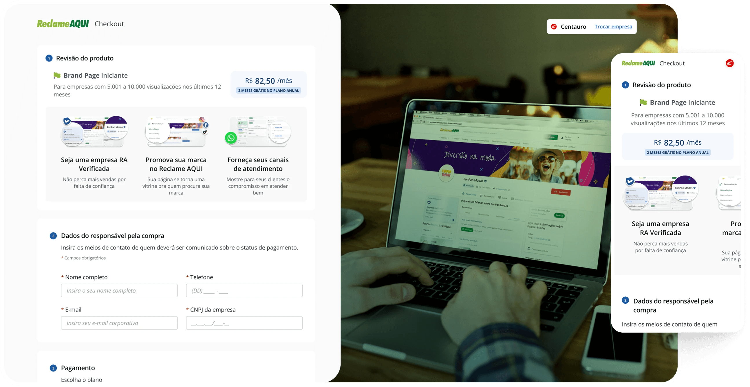
New checkout - Prototypes (version 1)
Payment page - Before
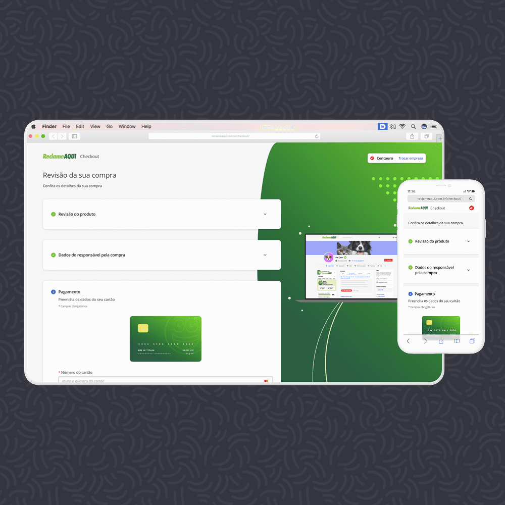
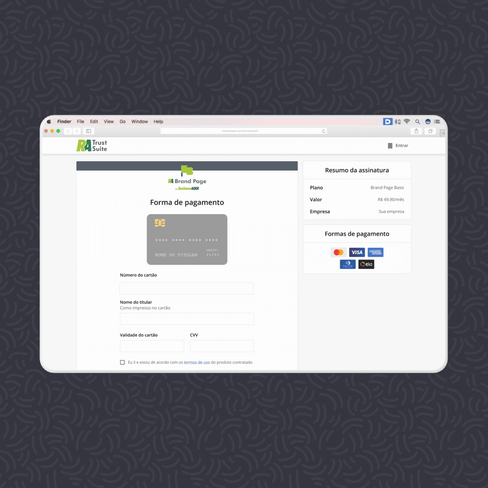
Payment page - After
Results
The first impacts
Impressive increase in revenue
Conversion increased by nearly 200% within the first 30 days post-launch.
Continuous optimization
Using Hotjar and metric analysis, we quickly identified and fixed post-launch
Sustained success
The conversion rate stabilized at around 15% monthly – an approximate 376% increase from the initial 3.15%.
Business impact
The checkout's success validated the strategy to pivot the "RA Verificada" product and justified the investment.
Team impact
The experience significantly contributed to the junior designer's development, leading to their promotion to an intermediate level after the project
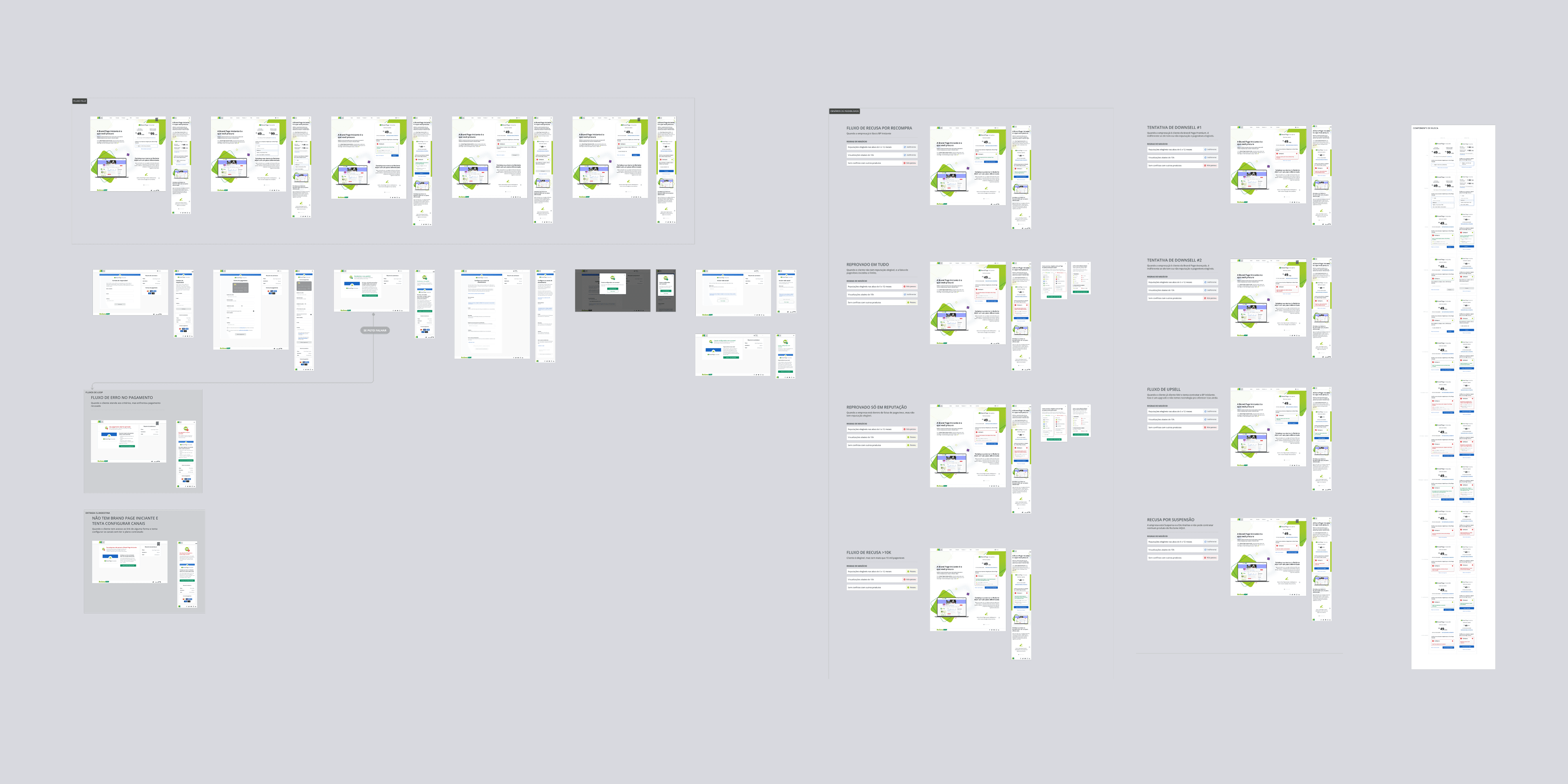
Iterations
A successful project is never really finished
Iteration #1: Addressing Initial Friction Points
Immediately following deployment, we dove into Hotjar reports. By watching user recordings within the first 24 hours, I quickly identified critical UX issues requiring urgent fixes. Once these immediate concerns were addressed, the team waited 14 days to gather more data and plan a comprehensive iteration.
Insight: We discovered the first step of the purchase summary was creating unnecessary friction. Users were confused about how to proceed, leading to drop-offs.
Solution: My proposal was to remove its primary call to action (CTA), allowing the user to naturally progress to the next step.
Result: This change proved effective, significantly smoothing the user's journey.
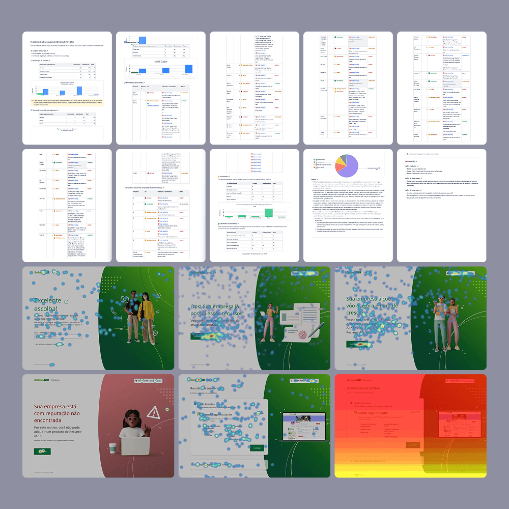
New checkout - Report of the first 14 days of performance
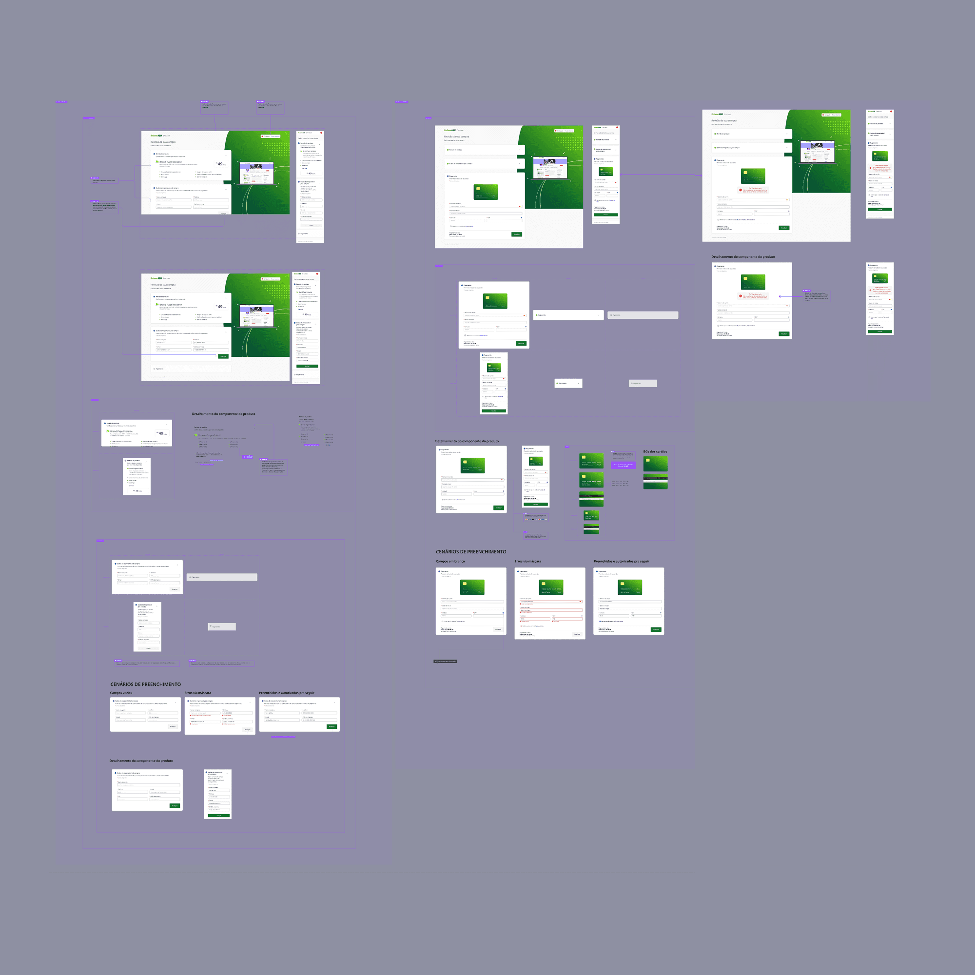
New checkout - Iteration #1 with adjustments on payment page
New checkout - Iteration #2 with new payment component
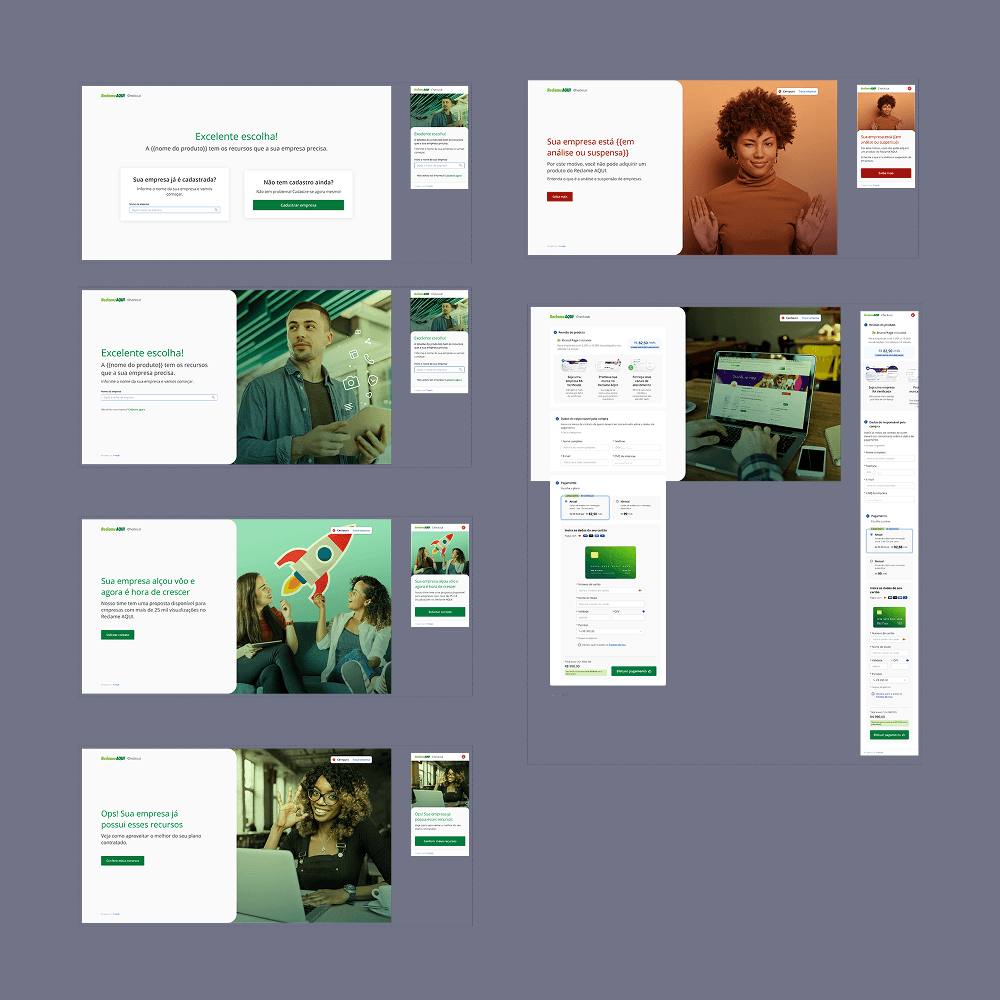
New checkout - Iteration #2 with new images
Iteration #2: Expanding Product Offerings
As planned, the next phase involved expanding the checkout to include annual payment options, which were previously only available on a monthly basis. This required a key adjustment to the payment step. We also seized this opportunity to update the visual assets, aligning them with the new design guidelines developed by the marketing team in parallel with our project.
While I left the company shortly after delivering these prototypes, teammates reported excellent results, though unfortunately, no specific metrics were available to me.
Learnings & next steps
What could've gone differently, and insights to use in the future
The Value (and Risk) of Testing:
Although the launch was successful, the absence of pre-launch usability testing posed a risk. This reinforced the importance of including testing whenever possible to mitigate risks and refine solutions before development.
Collaboration is Key:
Constant alignment between Design, Product, Growth, and Engineering was crucial for success under a tight deadline and with a pivoting product.
Rewarding Mentorship
It was gratifying to see the direct impact of the project on the junior designer's professional growth.
Future Opportunities (Post-MVP)
Integrate the product's other plans into the same checkout flow.
Embed the purchase experience directly into the main website, reducing reliance on external campaigns.
